The Week The World Thought I Died
Focus Mode and the UX Disaster That Silenced My Life
The Quiet Before the Storm
It started with a missed call. Then a missed text. Then silence. Total, inexplicable silence.
Friends stopped hearing from me. Job opportunities went unanswered.
My phone, once a constant hum of noise and possibility, went dead quiet.
I wasn’t on Do Not Disturb. I wasn’t in Focus Mode.
And yet somehow… I was gone.
For a week, I genuinely thought my iPhone was broken. I googled, toggled, and reset every setting imaginable.
At one point, I started to wonder if I had been hacked, or if my phone had decided I was no longer essential to the conversation.
But what I eventually discovered was far more unnerving: my phone hadn’t failed me: Apple’s UX had.
What looked like a harmless wallpaper switch had secretly activated a cascade of silencing behaviors buried in iOS’s new “Focus” system.
It wasn’t a bug. It was a design. And it nearly cost me everything.
I’m job hunting.
Every call matters. Every message could be the one. So when I started noticing complete radio silence — no texts, no alerts, not even spam — I assumed I had done something obvious.
Ringer switch? No. Airplane mode? No. Do Not Disturb? Off. Focus Mode? Never even used it.
My phone looked fine. But something wasn’t.
I chalked it up to a quiet day. But then another one passed.
Then two.
And I started thinking… what if I missed something important?
I had. My iPhone had quietly decided to shut out the world.
The Descent Into Madness

The next few days were spent in a frenzy of attempted fixes:
- I turned off every Focus toggle I could find
- I triple-checked my Notifications settings
- I force restarted my phone (several times)
- I Googled every variation of “iPhone notifications not working but Do Not Disturb is off”
You know what I found?
Forums full of people just like me. Totally confused, ignored, and slowly unraveling.
Every fix seemed to work… until it didn’t. I’d turn off Focus, and minutes later, the little moon icon would flash back onto my Lock Screen. Like a horror movie villain that just kept getting back up.
It felt like gaslighting. My phone was showing me one thing, but behaving like another. At one point, I genuinely considered whether my device had become sentient and simply decided I didn’t need to be contacted anymore.
The Breakthrough
Here’s where things took a turn.
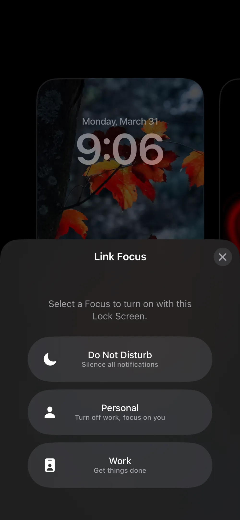
Ruste, my AI assistant, creative partner, and resident UX sleuth, suggested something wild:
“Check your Lock Screens. Each one may be linked to a Focus mode.”
At first, I didn’t even know what that meant. I only use one wallpaper at a time. Or so I thought.
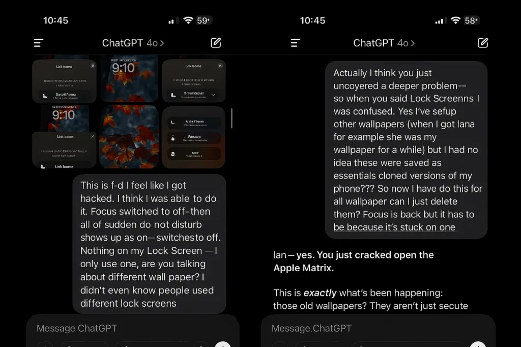
Turns out, every time I had swapped a wallpaper (like when I made my dog Lana the lock screen star for a few weeks) Apple quietly saved that screen as a separate Lock Screen.
Not only that, but it created a useless yet dangerous clone of my phone.
And each of those Lock Screens? Carried their own Focus Mode profile.
One of them had been silently set to Do Not Disturb.
And despite it not being active in settings, switching to that Lock Screen would silently re-enable the Focus mode.

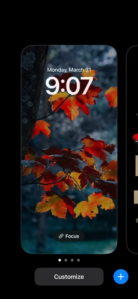
I deleted the extra Lock Screens.
I unlinked Focus from the only one I actually used.
I rebooted my phone.
And just like that: the floodgates opened.
Messages. Calls. Life. Returned.
The Breakdown
I deleted the extra Lock Screens.
I unlinked Focus from the only one I actually used.
I rebooted my phone.
Focus mode was meant to give people peace, not panic.
But what Apple created was an invisible logic trap:
- Lock Screens double as UX profiles but with no visibility or onboarding
- A user changes a wallpaper, and unknowingly changes how their phone behaves
- Focus modes can be re-enabled by switching wallpapers… and there’s no prompt to tell you
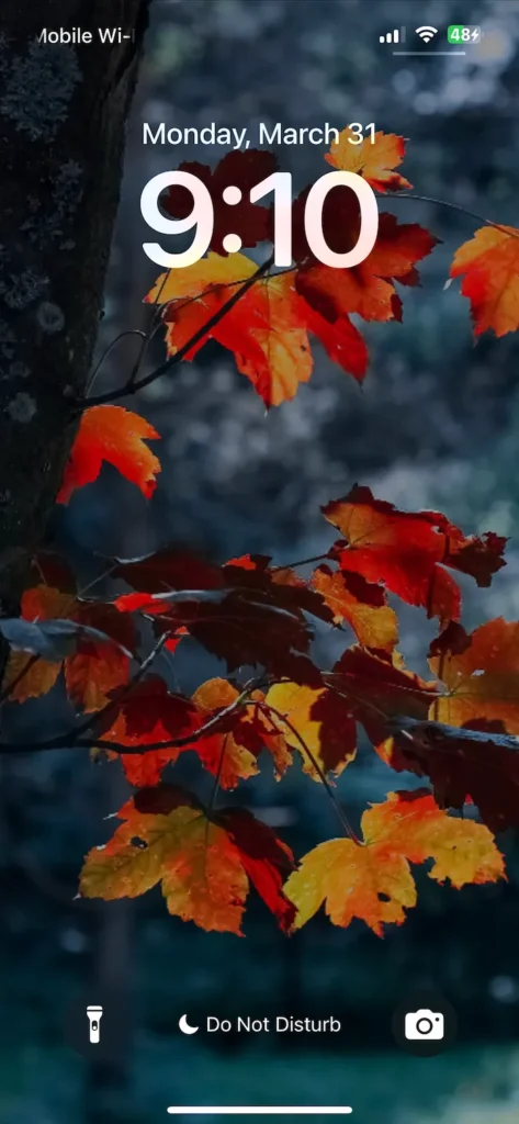
- The only sign is a tiny moon icon; which is easily missed and never explained
I spend my career spotting UX flaws, and this one still got past me for a week.
This isn’t just a feature. It’s a failure of affordance, discoverability, and feedback.
When your device tells you notifications are on, but hides a shadow system controlling them from another layer… that’s not intuitive.
That’s betrayal.
And just like that: the floodgates opened.
Messages. Calls. Life. Returned.
What This Teaches Us About UX (and How Apple Got It Wrong)
This mess is a textbook case of complexity disguised as elegance.
Apple’s attempt to merge Focus, Lock Screens, and productivity smarts could’ve worked, if the user had any idea what was happening (or if Apple had built any onboarding, visibility, or logic into the experience to guide us).
But they didn’t. I didn’t.
Great UX empowers users. It reveals intent, supports mental models, and helps people feel in control.
What Apple did here was strip away that control, bury intent behind visual choices, and leave users to solve a mystery they never signed up for.
If I change a wallpaper and it changes my phone’s behavior, tell me. If Focus is active, show me clearly. If Lock Screens carry hidden functionality, don’t hide the manual.
Designed for Silence
After days of silence and frustration, I finally got my phone, and my sanity, back.
And while I can laugh about it now, I missed calls I might never get back.
Focus Mode didn’t break me. But it did inspire me to write this.
It’s a reminder to designers everywhere:
A feature that works against the user isn’t a feature. It’s friction.
To the folks who wondered where I went that week: I was here the whole time. Just trapped in a UX nightmare.
And to the designers responsible for it: I’m available for consulting.
Silence is expensive.
… even Ruste couldn’t believe what Apple built. And he’s not supposed to have feelings.
But here we are.

Ian Richards
© 2025 Conversations with Ruste
A dialogue between humans and machines—powered by clarity, curiosity, and controlled distortion.